Duration 2 Months
August 28 - October 25
Project by Hyper Island
UX/UI Design
Summary.
Improve the user journey and boost conversion rates, reflecting Stuckies’ mission to deliver reliable and joyful products to families worldwide.
Enhance their website’s usability to provide a more seamless experience for their global customers. Known for their innovative “stay-on” sock technology, Stuckies has grown into a trusted global brand, helping parents keep those tiny socks in place—and making lives just a little easier.
Challenge.
Our main goal was to design a website that could be implemented on Shopify, based on the CEO's wishes. This came with both guidance and restrictions from Shopify, requiring us to go back and forth to check if our design was feasible. In the end, the CEO and we agreed that the design solutions were achievable and could be handed off to the developers without any issues.
Sabilise & Align
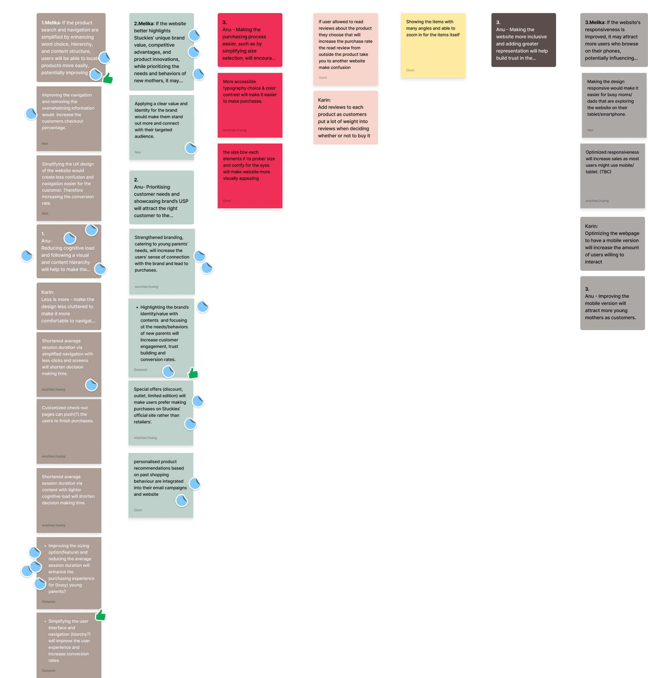
Our research included usability testing with 5 current users and 5 potential users.
A user survey with 129 responses
Expert feedback on Shopify marketing and trends.
We analyzed market trends in children’s apparel and conducted competitive research to identify opportunities for Stuckies.se. Focusing on user habits and pain points, we prioritized UI enhancements such as streamlined navigation, brand alignment, and accessibility.

Design a seamless purchase flow to ensure users can complete their orders effortlessly. We aimed to keep users engaged throughout the process. Include transparent and relevant information about Stuckies’ story, products, and vision, ensuring users feel confident before making a purchase.
Discover & Define
Parents need a seamless shopping experience and clear, trustworthy communication that highlights Stuckies' value.
We designed a seamless purchase flow to ensure users can complete their orders effortlessly. By minimizing friction, we aimed to keep users engaged throughout the process. To build trust, we included transparent and relevant information about Stuckies’ story, products, and vision, ensuring users feel confident before making a purchase.
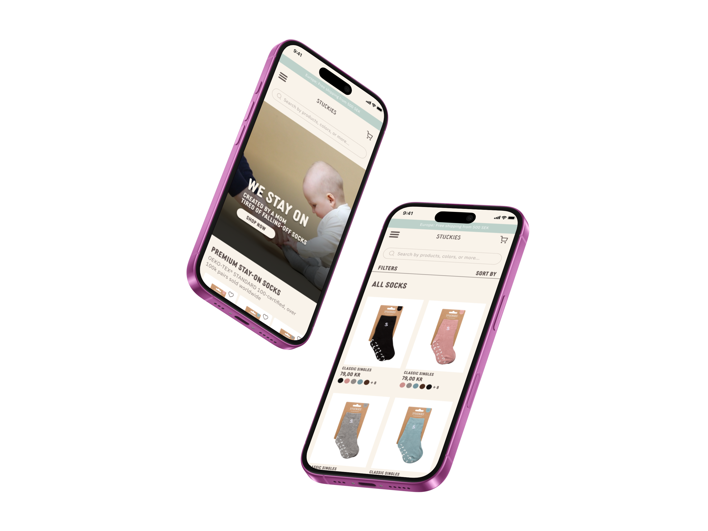
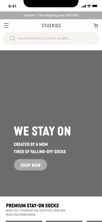
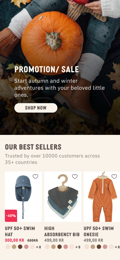
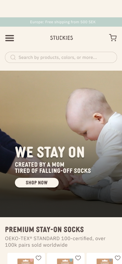
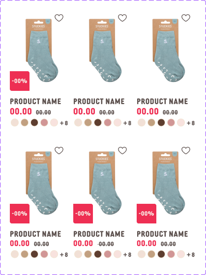
Key updates included enhancing text readability with light shadows, simplifying navigation for easier access to discounts, and adding a red discount label. We incorporated an engaging video to communicate the website's purpose and improved button contrast for better visibility.
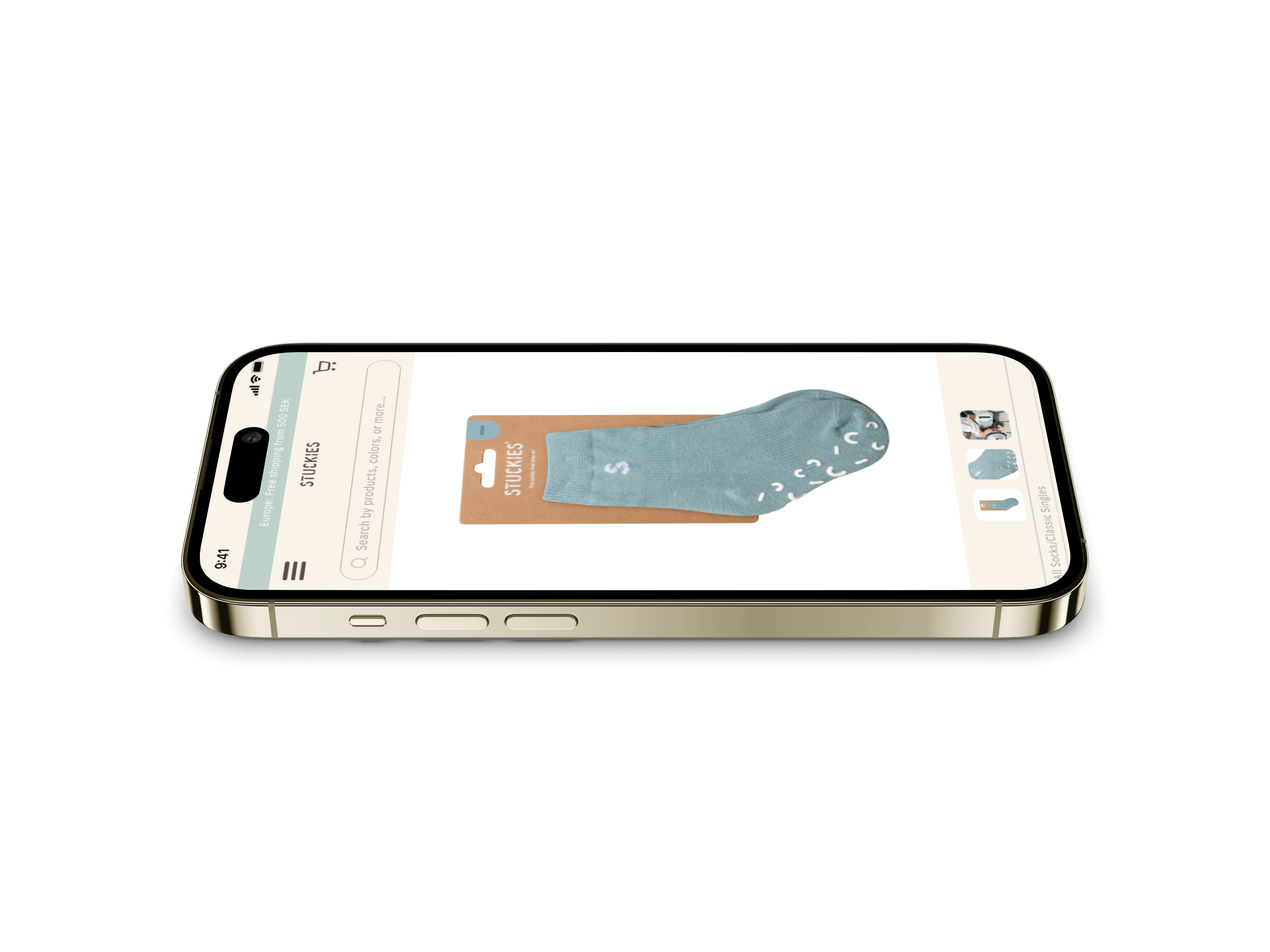
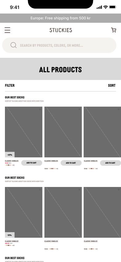
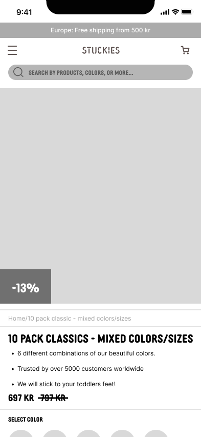
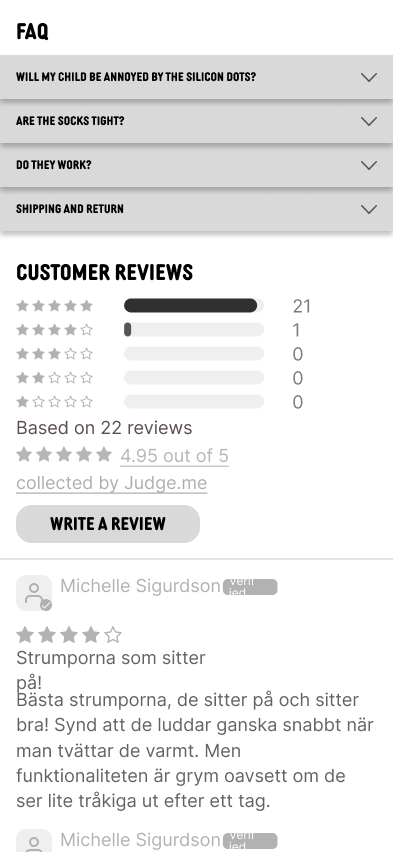
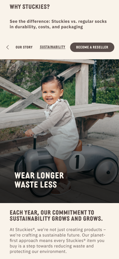
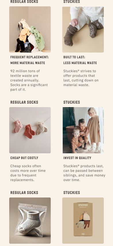
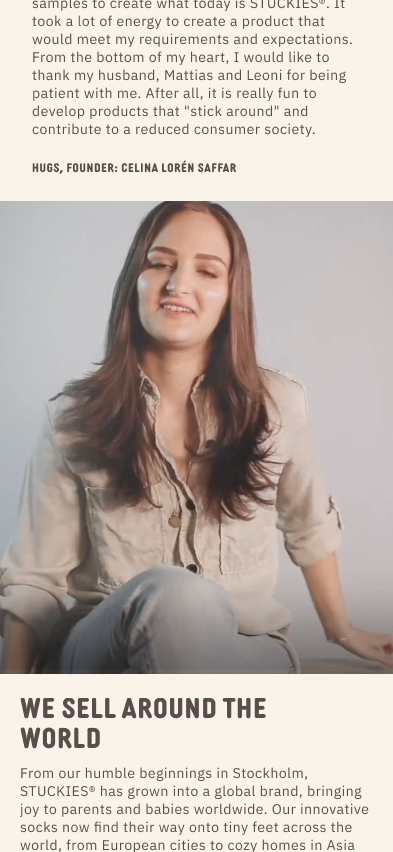
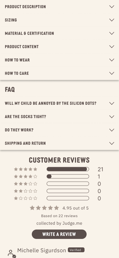
To reflect diversity, we used inclusive imagery and highlighted Stuckies’ advantages over fast fashion in terms of quality and sustainability. The Story page shared the brand’s origins with a personal video from the founder. For product pages, we streamlined descriptions and added a review system for easy access to customer feedback.
Produce & Deliver
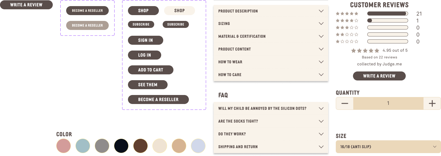
For our design system, we created consistent elements such as buttons, typography, colors, and components to ensure a seamless user experience across all pages. This system helps maintain design consistency, improves efficiency, and makes future updates easier.
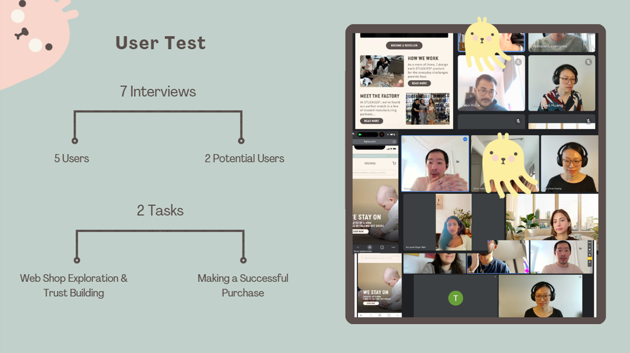
Creating the design for the website we also made it a prototype to make it possible to do some user testing. We were able to gather 7 interviews, in which was 5 users and 2 potential users for the prototype created.
Gathering new findings from the usertests we were able to share the information with the client and also implement the changes to Shopify. To make it possible to change the layout on Shopify, the design on figma was used as a blueprint to follow and manually implementing the changes to Shopify. This lowered the cost for the client by not hiring a developer to make the changes, instead she made the changes herslef.