Duration 5 Months
January 22 - June 11
Project by Frank Fam
Pruduct Design
Summary.
Main landing page should be high-level and talking to investors, politicians, journalists, EU officials and the C-Suite as major audiences in addition to increase the conversion rate for software developers.
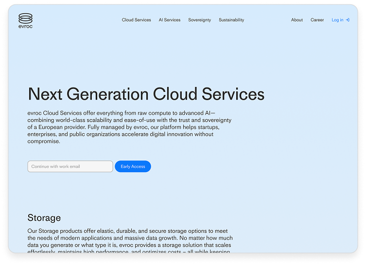
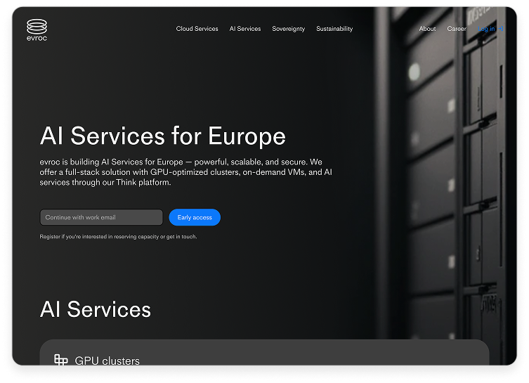
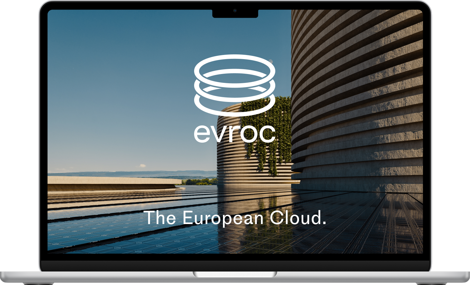
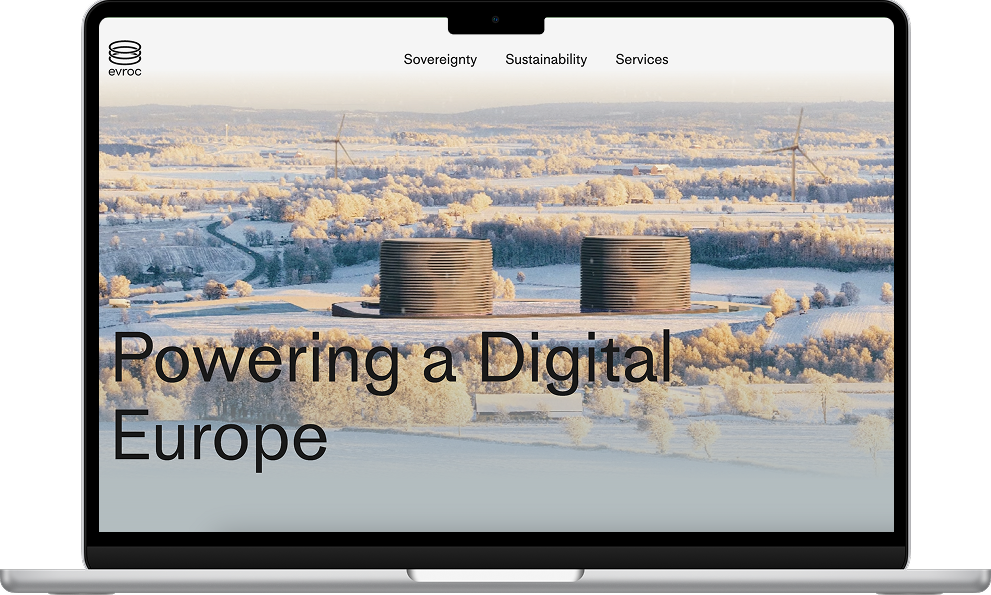
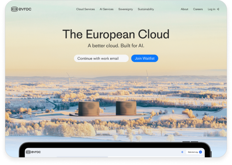
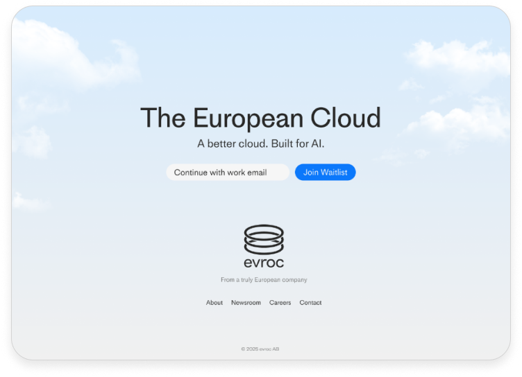
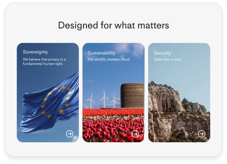
evroc is a European cloud provider built on the principles of privacy, sustainability, and high performance. With servers located entirely within the EU and full European ownership, evroc ensures that data remains sovereign and protected under European privacy laws—free from foreign access without EU court approval.
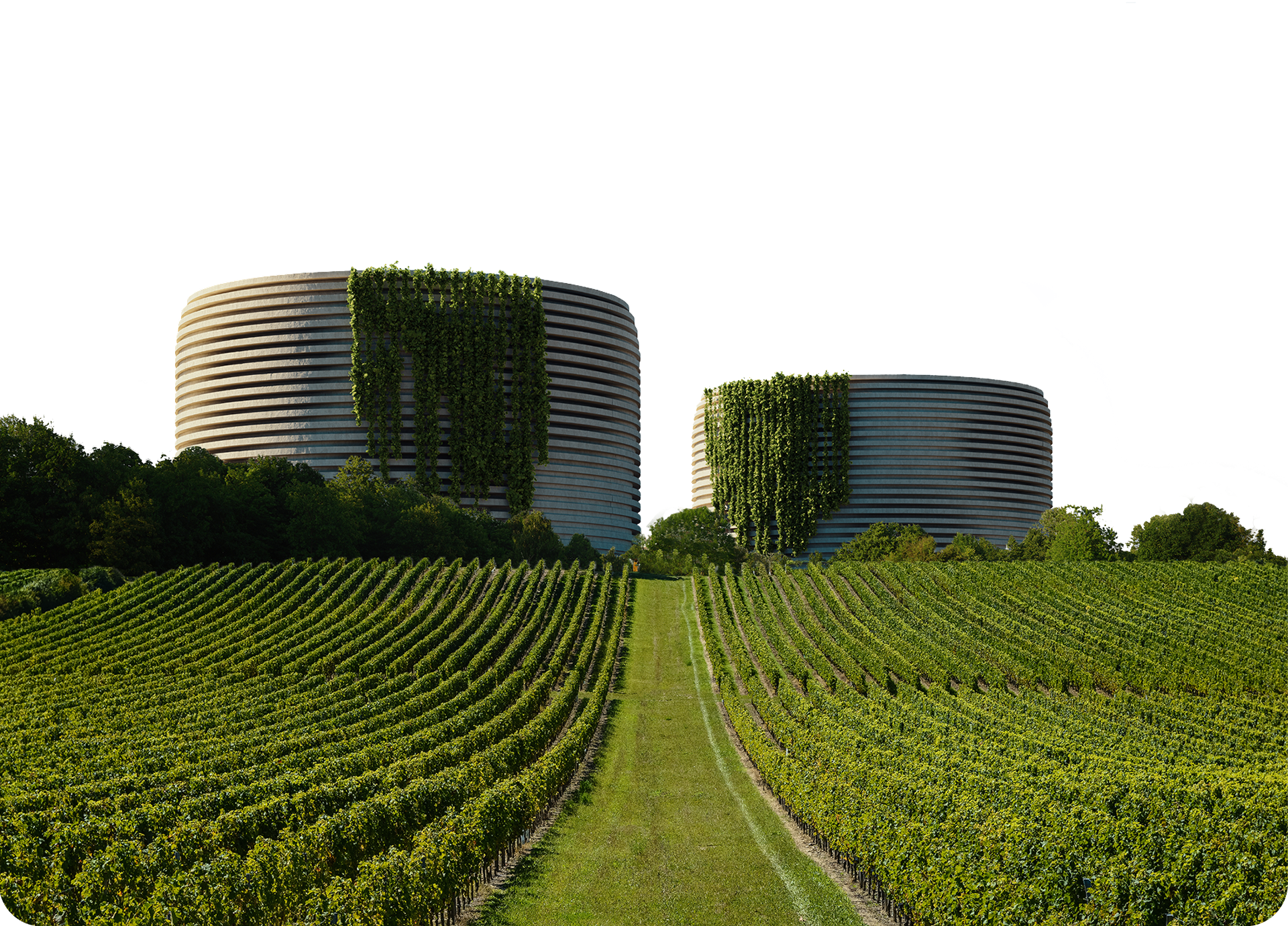
Beyond privacy, evroc integrates sustainability at its core, designing its cloud infrastructure to minimise environmental impact through efficient architecture and renewable energy use.
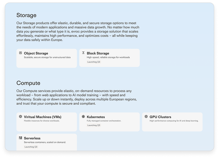
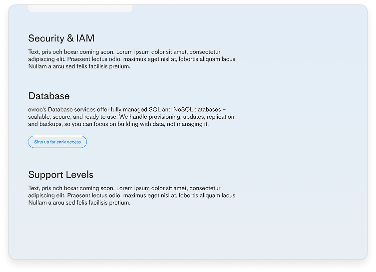
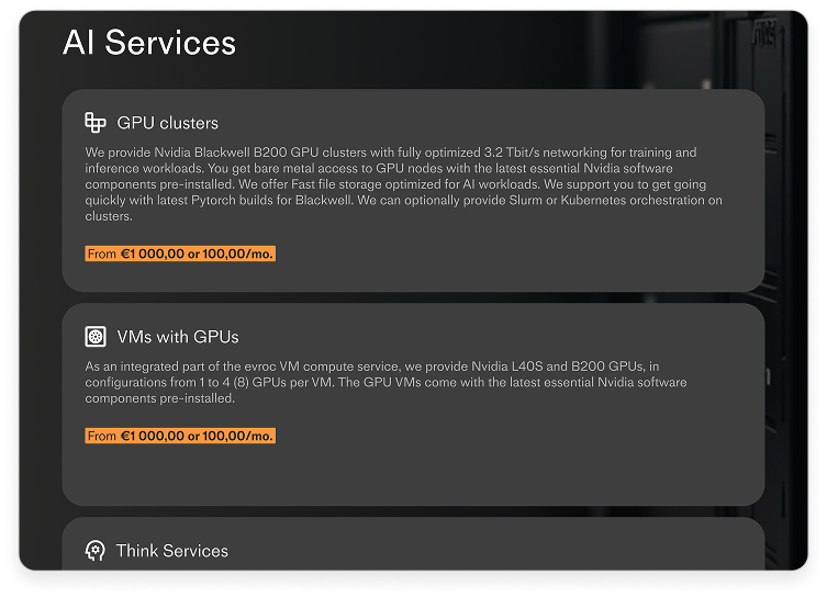
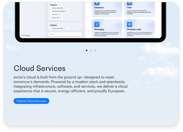
Technically, evroc offers a comprehensive suite of cloud services, including compute, storage, networking, and application integration—all optimised for security, reliability, and developer experience.
Challenge.
Find a solution to adapt the homepage for the investors, politicians, journalists, EU officials, C-Suite and software engineers. Awaken the interest in both aspects, showcase that evroc is a big upscale company that will change the European cloud.
Finding a hierarchy that will benefit both investors and their customers (software engineers) to be interested working with evorc.
Timeline.
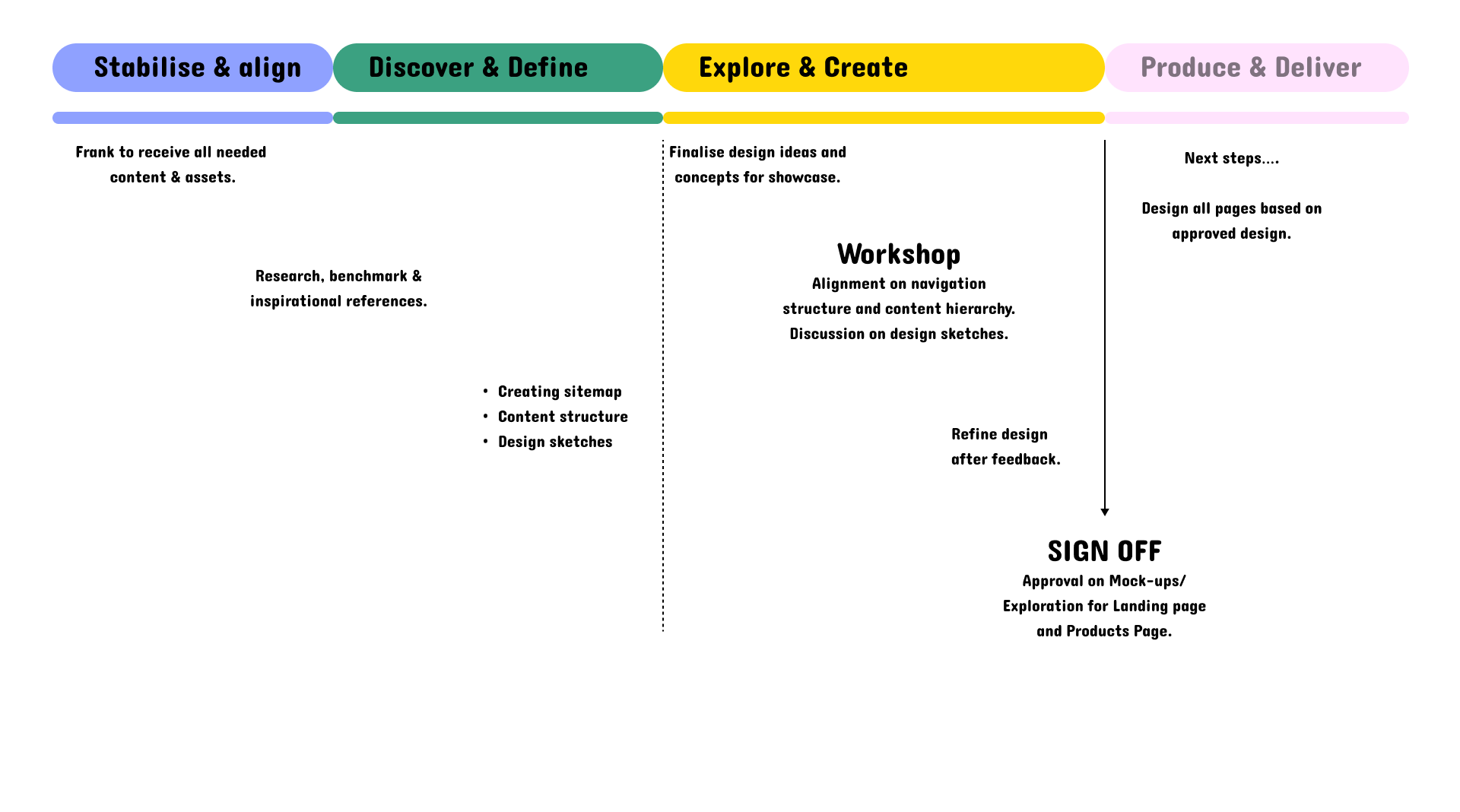
Sabilise & Align
At the beginning of the project we got some very clear guidelines what the company was after. The CEO (Mattias Åström) is very fond of what Apple and Tesla does including their website. Under our inspiration exploration we discovered other sources with the same feeling of what they were after.
We synthesised our insights into two design themes that allowed us to explore how visual language and interaction style could impact user experience.
Captivating tech & information
Leaned into bold visuals, immersive interactions, and layered information. The goal was to captivate users through rich content, interactive elements, and a sense of discovery. It was inspired by platforms that encourage exploration and reward curiosity, blending technology and storytelling.
Simplicity & modern tech
It emphasised a frictionless user experience, leveraging the principles of modern design, ease of navigation, and a calm visual tone. Inspired by contemporary tech brands that focus on user empowerment through simplicity.
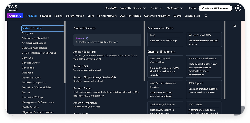
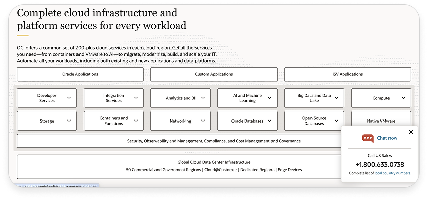
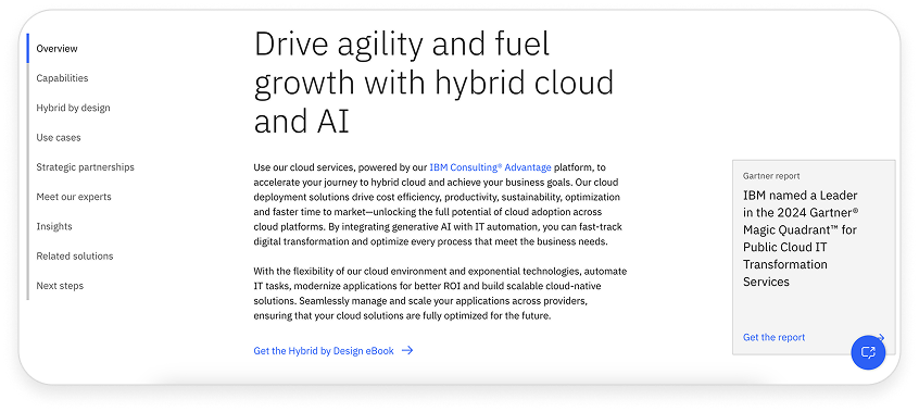
One of the most valuable outcomes of our competitor analysis was identifying what we intentionally didn’t want to replicate.
Many leading cloud providers rely on dense technical jargon, generic visuals, and a corporate tone that can feel cold or overwhelming.
We saw this as a key opportunity to set ourselves apart. Our goal was to design an experience that clearly differentiates evroc as a new kind of cloud service, one rooted in European values such as transparency, trust, digital sovereignty, and human-centered design.
Discover & Define
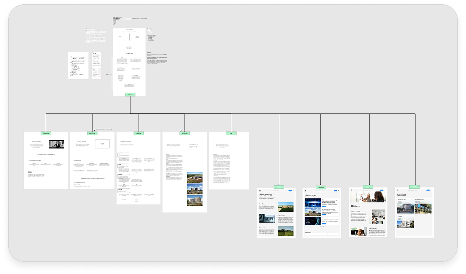
Before diving deeper into design, we needed a clear understanding of the website’s structure. While our immediate goal was to design the landing page, mapping out the full sitemap early on helped us set a strong foundation for scalable design.
The landing page was the primary focus to make to create the new design for evroc. By visualising the structure, we were able to assess and improve the navigation system, making it easier for users to move through the site.
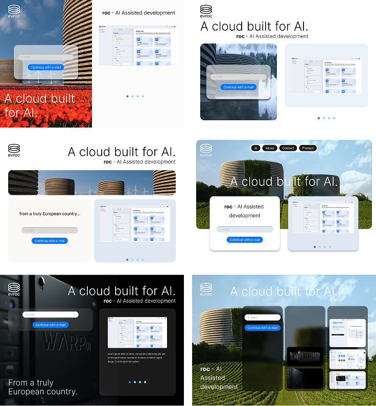
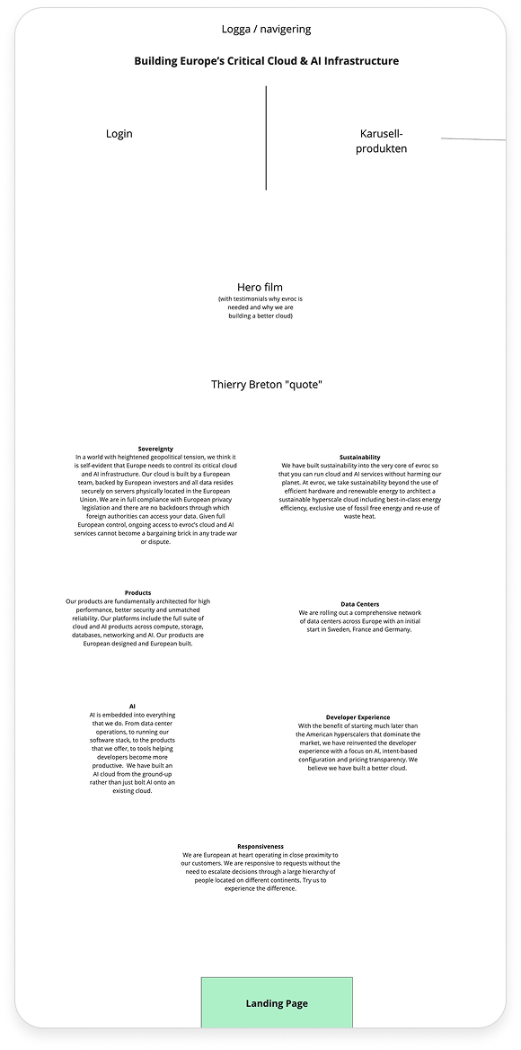
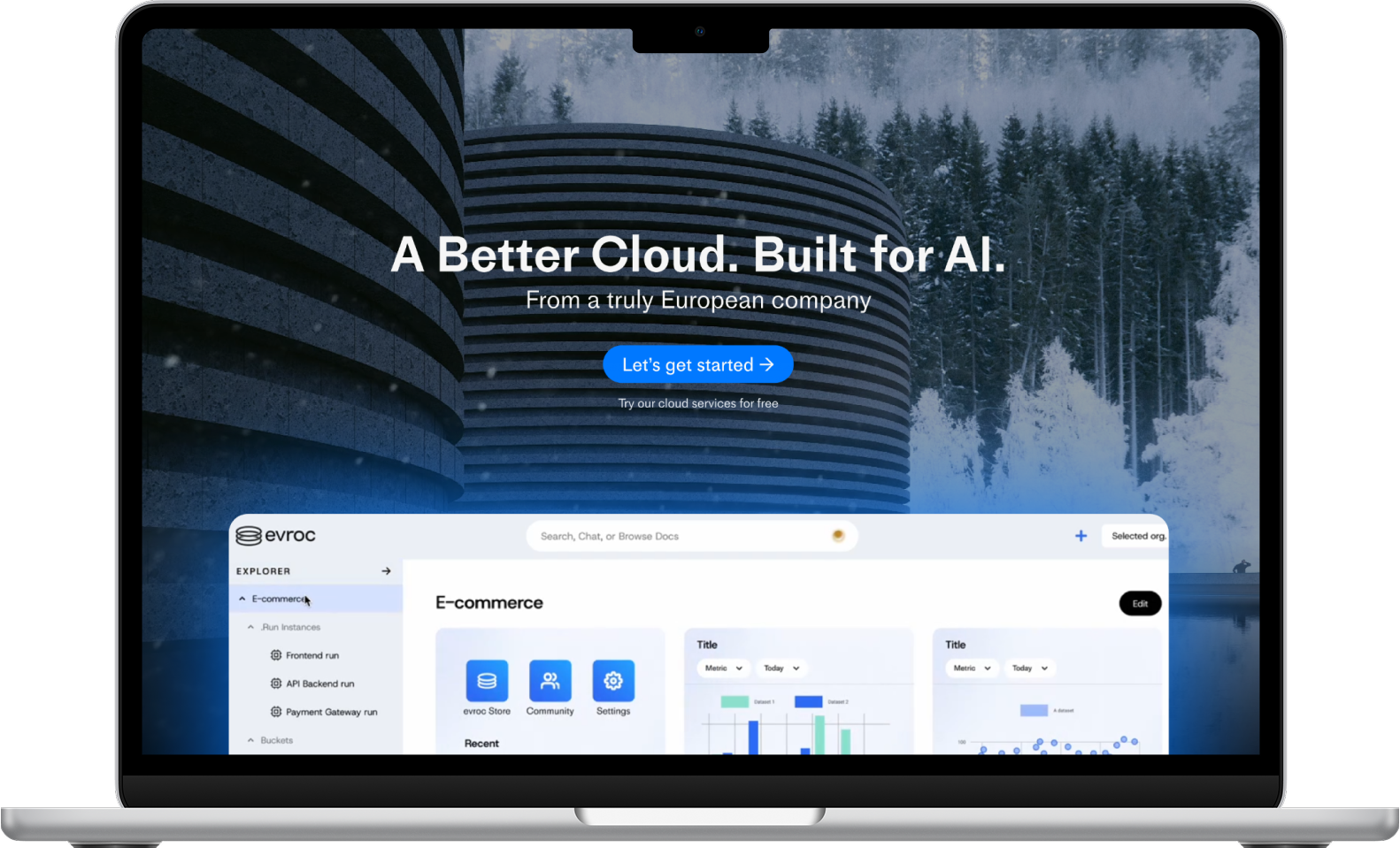
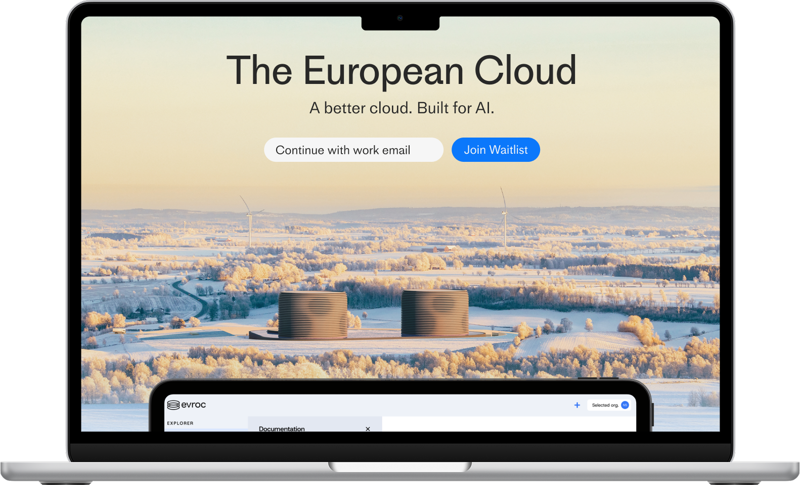
Different Hero concepts. Creating a split screen for login and a carousel that showcases the software.
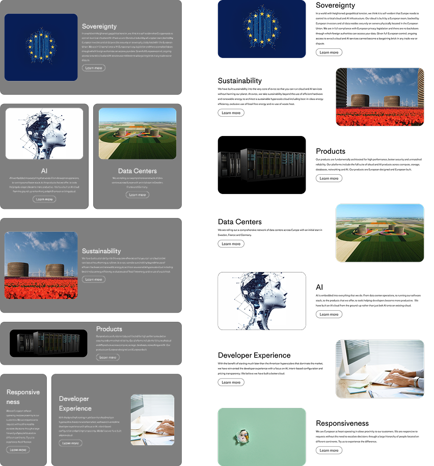
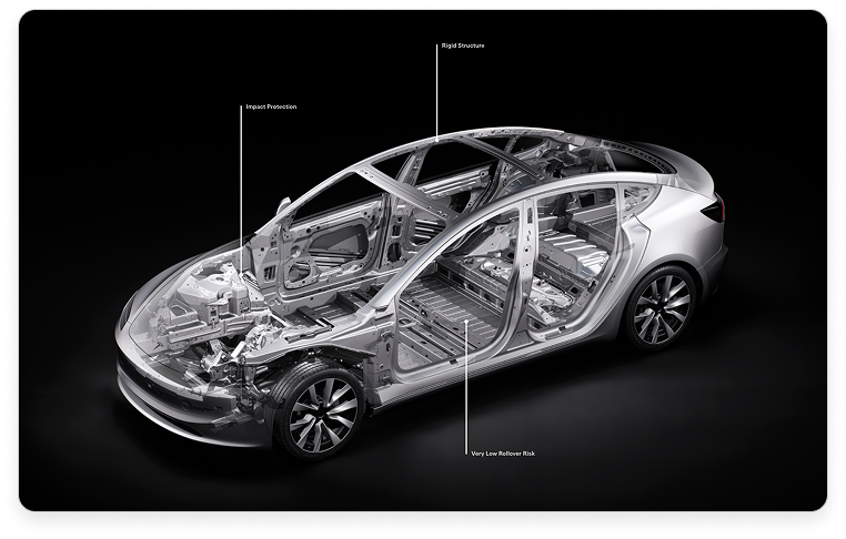
Example to showcase the information that is going to be on the landing page. Either boxes/cards or a more airy example with cross pattern for better clarity.
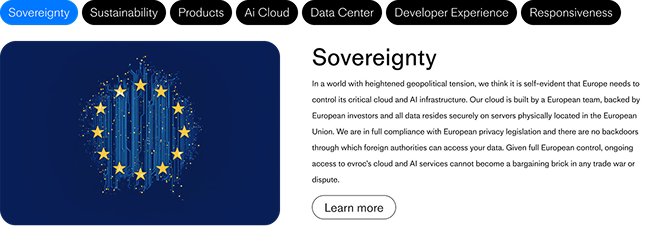
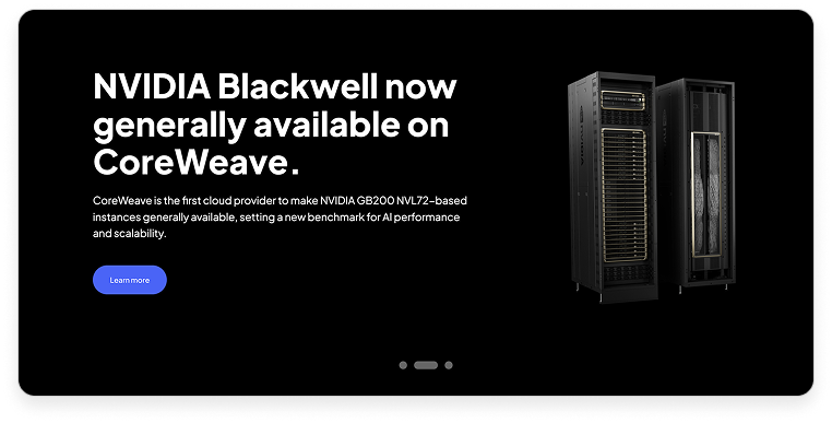
A carousel that has it’s own navigation bar to select the different choices to read about.
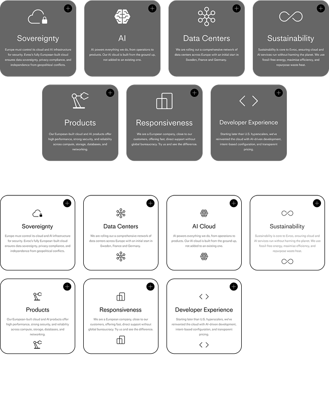
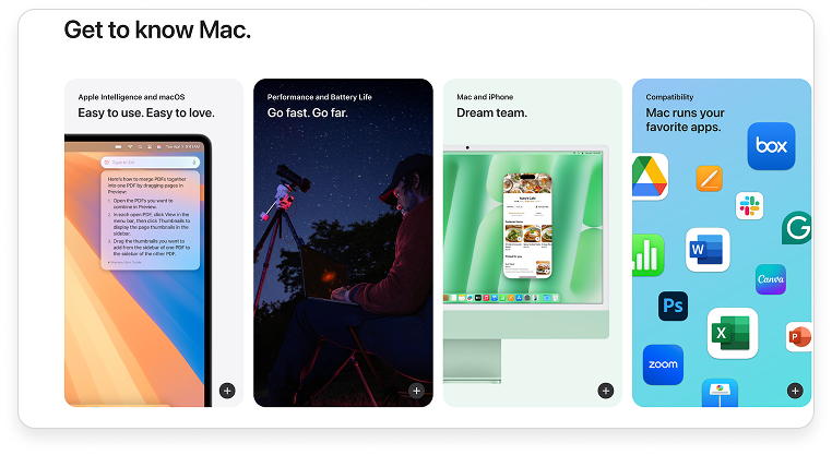
Another card with icons, contains less information but you are able to press the “+” to read more.
Explore & Create
From the workshop with evroc we received a lot of necessary feedback and guidelines to proceed with the final drafts.
We were able to create two different variants of design for evroc. Draft 2 was the one they liked the most which gave us the opportunity to create the whole website for them with the same vibe.
Produce & Deliver

Sending our designs over to the developers and bringing them in to the loop of delivering a working design with functionalities that is needed for the website to bring in users was a big step.
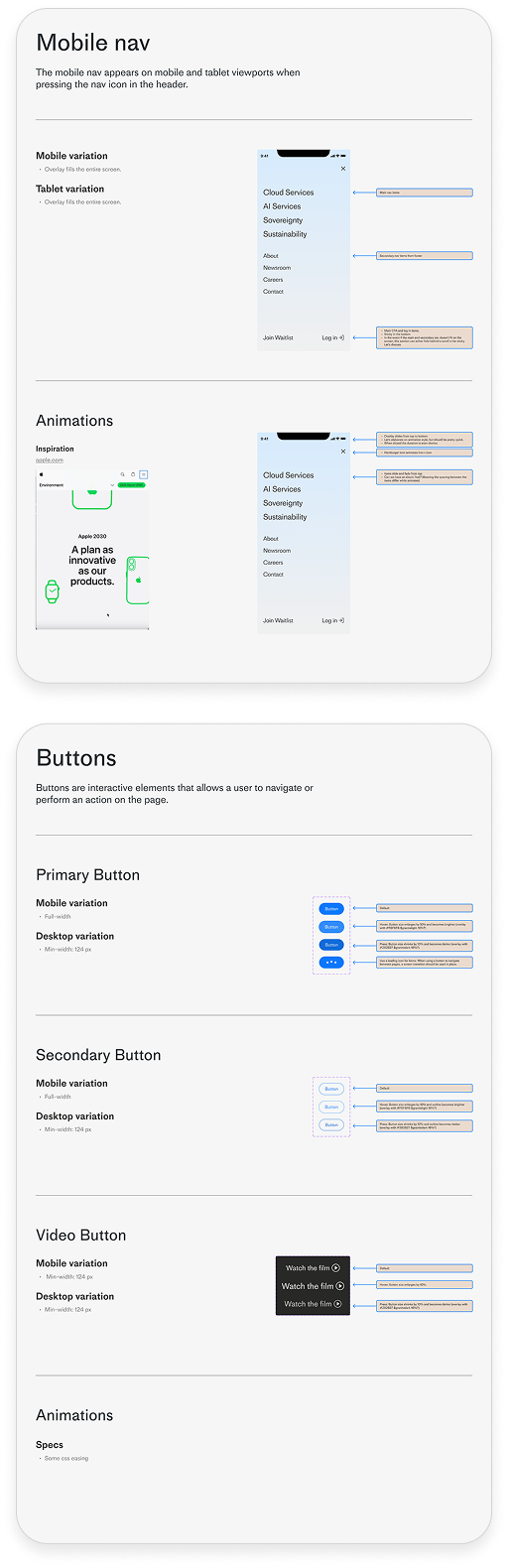
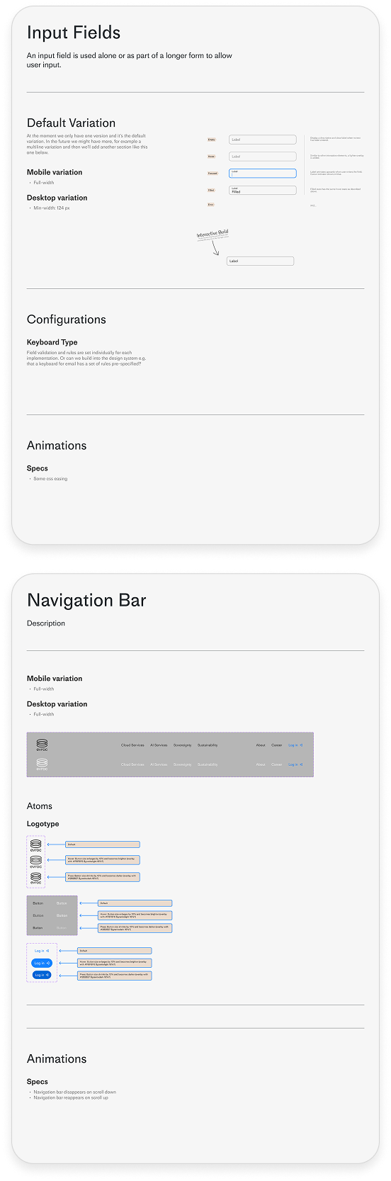
To make it easier for the developers working
from our design we decided to create sections for individual components with instructions for the animations, visuals, configurations.
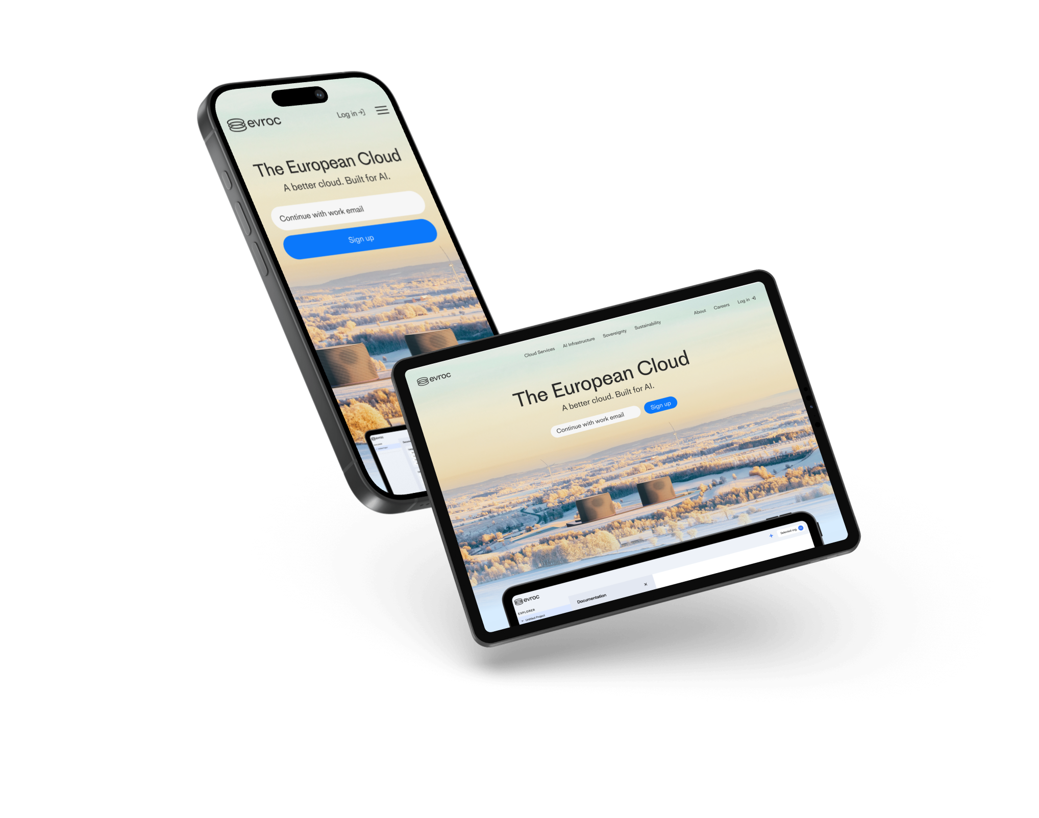
And of course bringing them designs for the different varieties of devices to make the website optimised!